Assignment:
Creating Visual Representations of Data
KENAI FJORDS NATIONAL PARK
SKILLS
.Save a workbook with a new name
.Create a column chart
.Move a chart to a new worksheet
.Reorder worksheets
.Apply a style to a chart
.Insert a chart title
.Format a chart title
.Remove the legend from a chart
.Insert a vertical axis title
.Rotate and tilt a 3-D chart
.Modify the depth axis
.Insert a chart data table
.Format a data series
.Select non-adjacent cells
.Create a 3-D pie chart
.Move a chart as an object to a different sheet
.Add data labels
.Format a chart area
.Resize a chart
.Position a chart
.Add data bars to a range of cells
.Edit a conditional formatting rule
PROJECT OVERVIEW
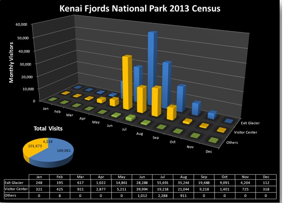
Maria Sanford is the chief of interpretation at Kenai Fjords National Park. Part of her job is to report on park usage at the visitor centers. She wants to create a chart sheet that displays the park usage data. She has recorded last year's usage data in an Excel workbook. She asks you to present this data in a 3-D column chart for an upcoming meeting with her supervisor. She wants the chart to show the monthly usage totals organized by visitor center. She also wants a 3-D pie chart superimposed on the column chart and a table of park usage data.
STUDENT START FILE
NP_Excel2010_T4_CP1a_FirstLastName_1.xlsx (Note: Download your personalized start file from www.cengage.com/sam2010)
Instructions
1. Open the file NP_Excel2010_T4_CP1a_FirstLastName_1.xlsx and save the file as NP_Excel2010_T4_CP1a_FirstLastName_2.xlsx before you move to the next step. Verify that your name appears in cell B4 of the Documentation sheet. (Note: Do not edit the Documentation sheet. If your name does not appear in cell B4, please download a new copy of the start file from the SAM Web site.)
2. In the Park Usage Data worksheet, select the range A3:D15, and then insert the 3-D Column chart (the last chart in the 3-D Column section in the Charts gallery).
3. Move the chart to a chart sheet named Monthly Visits. (Note: Be sure to choose the "New sheet" option button rather than the "Object in" option button.) Move the Monthly Visits chart sheet to be the last sheet in the workbook.
4. Change the style of the chart to Style 42 (the second style in the sixth row in the Chart Styles gallery).
5. Insert the chart title using the Centered Overlay Title format, change the title to Kenai Fjords National Park 2013 Census, and then set its font size to 24 points. Remove the legend from the chart.
6. Add the title Monthly Visitors to the vertical axis, using the Rotated Title option. Set the font size to 14 points.
7. Rotate the 3-D chart using the following parameters: x-axis rotation 30°, y-axis rotation 20°, perspective 25°, and depth to 130. (Hint: If necessary, uncheck the Right Angle Axes check box in the Chart Scale section to make the Perspective box active.)
8. Modify the depth axis so the values are displayed in reverse order. (Hint: Use the Axes button in the Axes group on the Chart Tools Layout tab to modify the depth axis using the Show Reverse Axis option.)
9. Insert a data table without legend keys below the 3-D chart to provide the data values for the different columns. (Hint: Use the Data Table button in the Labels group on the Chart Tools Layout tab.)
10. Change the fill color of the Visitor Center series to standard Orange.
11. In the Park Usage Data worksheet, select the range B3:D3; B16:D16, and then insert a Pie in 3-D chart. Move the chart to be an object in the Monthly Visits chart sheet.
12. Insert a chart title using the Above Chart format with the text Total Visits, and set its font size to 16 points and its font color to White.
13. Change the fill color of the Visitor Center slice to standard Orange.
14. Remove the chart legend from the pie chart.
15. Add data labels to the Inside End of the pie chart, displaying each slice's value.
16. Change the shape fill of the chart area to No Fill (removing the fill color) and change the shape outline to No Outline (removing the border). Resize the embedded pie chart and move it to the lower-left of the column chart so that the chart sheet matches the Final
Figure below.
17. Go to the Park Usage Data worksheet, and then add data bars to the range B4:D15. Modify the rule for the data bars so that the maximum data bar length matches a value of 100,000.
Your completed chart sheet should look like the Final Figure below. Save your changes, close the workbook and exit Excel. Follow the directions on the SAM Web site to submit your completed project.
