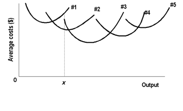
The following diagram illustrates the short-run average total cost curves for five different plant sizes of any firm. The shape of each curve reflects: 1) increasing returns, followed by diminishing returns. 2) economies of scale, followed by diseconomies of scale. 3) constant costs. 4) increasing costs, followed by decreasing costs.
Help me to get through this problem.