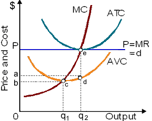
The curves demonstrated in this figure reflect that: (i) operation in the short run since fixed costs can be measured in the graph. (ii) a disequilibrium that will force some competitors to exit this market. (iii) how firms innovate new technologies in response to profit opportunities. (iv) a disequilibrium for the industry which will attract new firms within the market. (v) a firm making total economic profit equivalent to area aPed.
Please choose the right answer from above...I want your suggestion for the same.